


Apr
When Daniel Craig was spotted at the Planet Omega Exhibition grand opening last year in New York City many were surprised to see the former 007 wearing a watch that could not be identified but seemed to bear a resemblance to the most iconic watch Omega has ever produced.
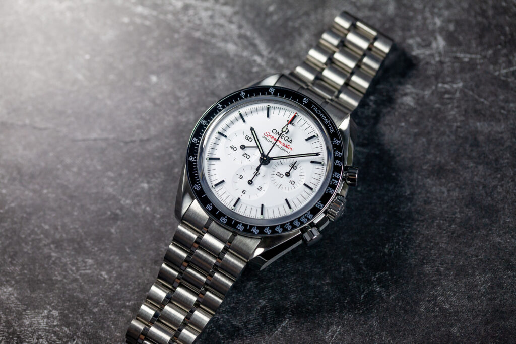
A few months later it became clear that the watch was none other than the Speedmaster Moonwatch we all know and love but fitted with a new white lacquer dial. Such a simple color addition wouldn’t usually cause this kind of commotion but in terms of the first watch ever worn on the moon this was huge news. For decades the design has largely stayed true to the original with its highly legible black dial. Although many limited-run renditions of the timepiece have been made through the years with various dial colors and materials used, the original stainless steel version has remained a constant.

Upon initial release a wave of interest hit the industry with prices on the secondary market soaring past retail which is pretty impressive considering that it is not limited in any way nor does it require an incredibly long wait at the AD. And yet, the fandom persists.
But is the hype really worth it? Does the watch stand on its own? A closer look reveals some noteworthy details that might go unnoticed by the untrained eye.
First of all it is worth mentioning that this version of the space-faring tool exclusively comes with a sapphire crystal and matching transparent case back, also known as a “Sapphire Sandwich”. Bye bye, hesalite.
Fitted with the same caliber as its older brother, the 3861 hand-wound movement carries a 50 hour power reserve and is a Master Chronometer making it highly resistant to magnetism while keeping an incredible time of -0/+5 seconds per day.
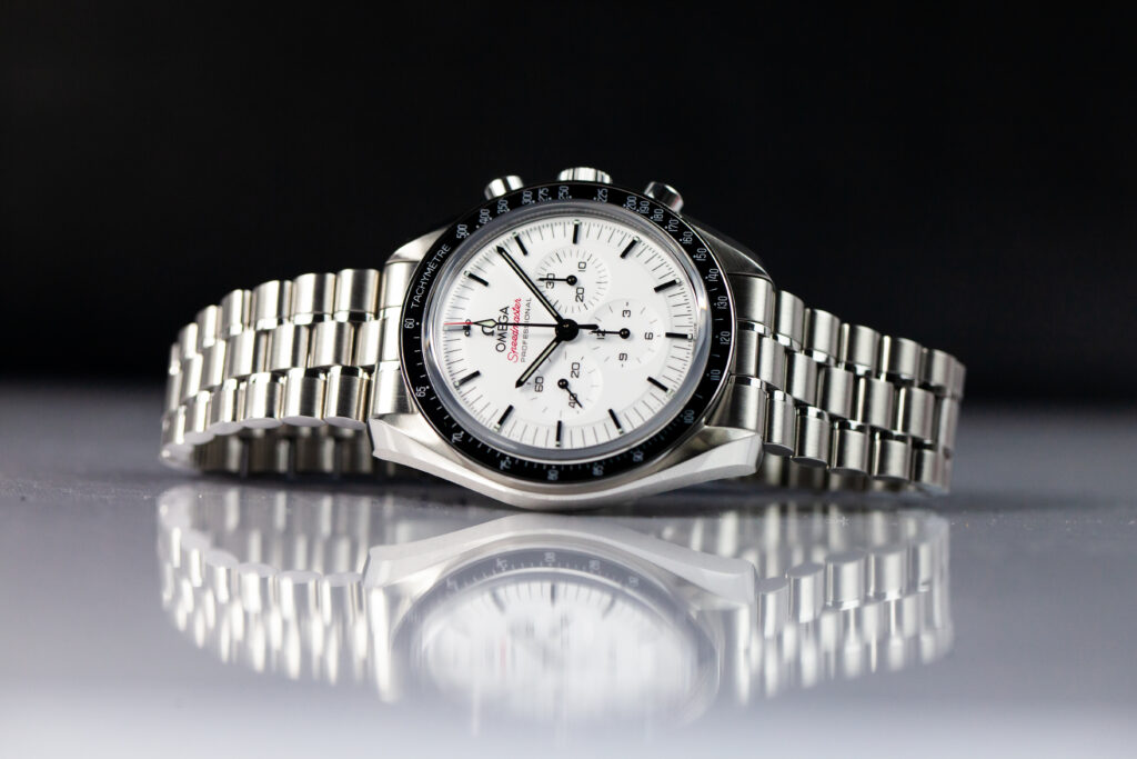
Looking at the face of the watch it’s important to note that the white dial has a lacquer finish giving it a smooth deep shine instead of the flat textured finish of the original. Pitch black indices create a punch of contrast matching the classic black Tachymeter bezel. The “Speedmaster” text and the chronograph hand’s tip are done in a striking red. Omega states the dial choices were inspired by the suit of an astronaut while the red accents are a nod to the red lines used to identify their ranking. Although that explanation makes sense, many fans can’t help but bring up a few other comparisons.
For one, the dial looks a lot like the fan favorite white Omega Seamaster which also has a black bezel with a red header. The piece also reminds us of the Omega Alaska Project which also sports a red, white and black color scheme. And if we look outside of the Omega brand, the dial is not unlike that of the white Cosmograph Daytona by Rolex – at a fraction of the cost of course.
Available for only $100 more than the original black dial version with no indication of going anywhere it seems this new Omega Moonwatch is here to stay. Longtime fans of the brand will likely pick this one up in one small step for another daily wear to throw into the mix while the newcomers might just finally make the leap.